

BEZZA
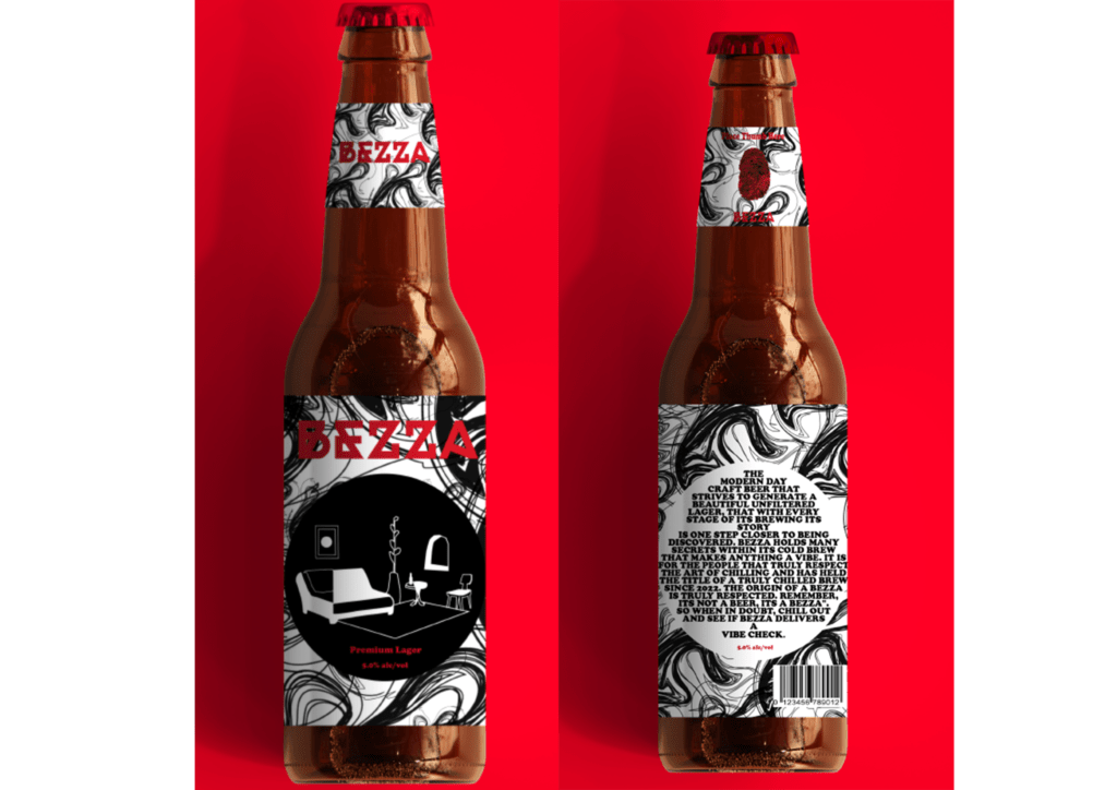
The project brief requires for a product that is unique, innovative, and sustainable. I decided to create a craft beer brand called “Bezza” which is a slang term in south Africa for beer. Referring to research I had gained a lot of knowledge of craft beer as well as sustainable packaging through Carlsberg beer company who were one of the first to implement sustainable packing for a beer brand.
Further along I gained a lot of inspiration design wise through gin bottle packaging designs. Since my target audience is 26-41 (narrowed down to mid-30s), I wanted to create something that allocated to that age range and their basic design interests. The living room setup was designed in a modern manner as well as it being very abstract and simple. This design I found to be aesthetically pleasing and it was a balance of elegance and simplicity which represents a calm and relaxing vibe. Black and white are classic colours and it targets people of all ages but to up the design aspect and make it unique, I decided to use red as it is bold, calming, and gender neutral.
MWANZO Magazine

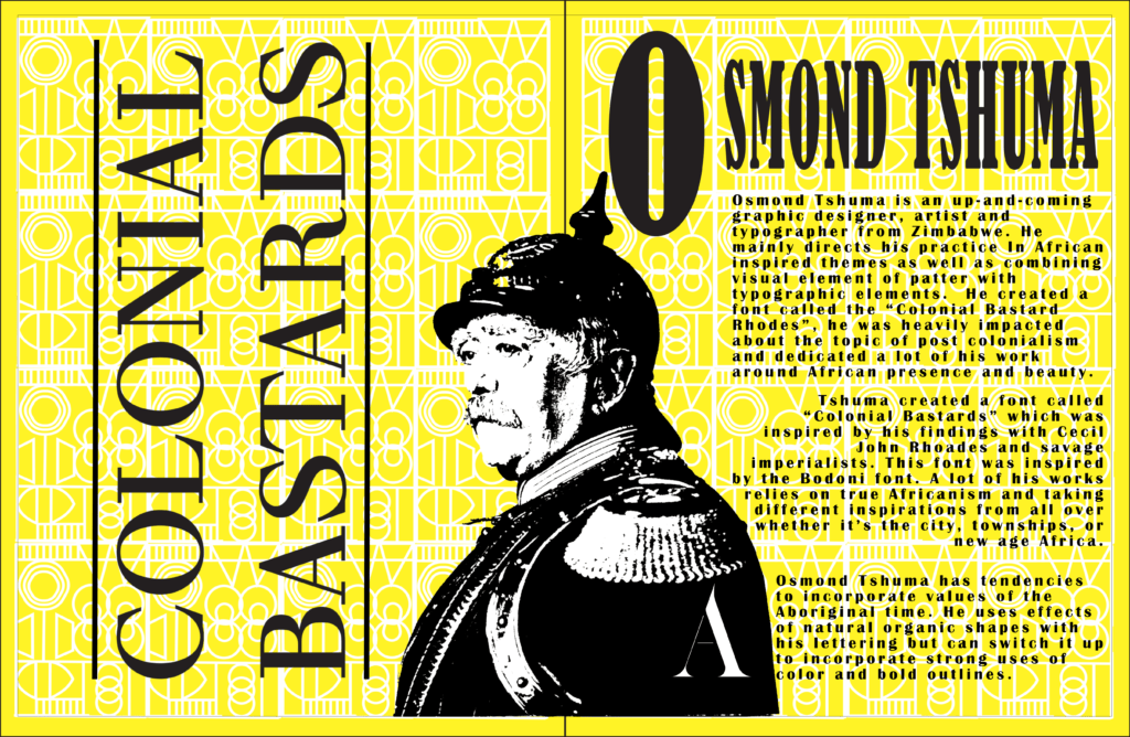
My objective for this magazine is to reach students and aspiring artists and educate them and fill them in on local African designers and how intriguing their work truly is. To show the beautiful talent and hidden stories about their work and life. My concept is “a story through type” as Osmond Tshuma dedicated colonial bastards to a historical time. He literally created a story through the use of type and design in his own way. That’s why I included imagery of two colonialists and elements of Africanism so like the design aspect, it is also balanced out historically with Osmond’s heritage or African roots with the white radical colonialists.
The concept is for the magazine to be used as an education resource for students, writers and artists that can learn about local artists and typographers whose design work has moral importance to it and to get other to tell a story through type. It satisfies my design objective because everything links, I have visual components of what his typeface is based off, such as Cecil Rhodes and Otto Van Bismarck. I incorporate his struggle and story telling with mine which is the other component of Africanism and Aboriginal times. The typeface has inspired me to create a magazine that does justice for his work as well as mine. The look of my designs is rather raw and straight forward. Its bold and in your face, I wanted that cause the subject matter is bold and raw. I never used his exact colonial bastard’s font in the writing as I didn’t want to copy or to be focused on that font. I just added a little A on the jacket of otto.
The writing is bold and easy to see, it is professional on a seemingly playful background. There is beauty in the harshness is how I like to view it. Everything is large but yet enough space for the eye to wonder and to have it capture the consumers attention. The entire reasoning behind the elements of colonialists and African inspiration was to honour Osmond’s bravery and story telling through his type as well as embracing true Africanism in a post colonialist country. Something I would say is unique would be both the dark, bold colonialists in the Centre of each page/s. I think it is unique because the style is so different to the rest of the magazine but yet it works so well together
De Waal Park Rebrand
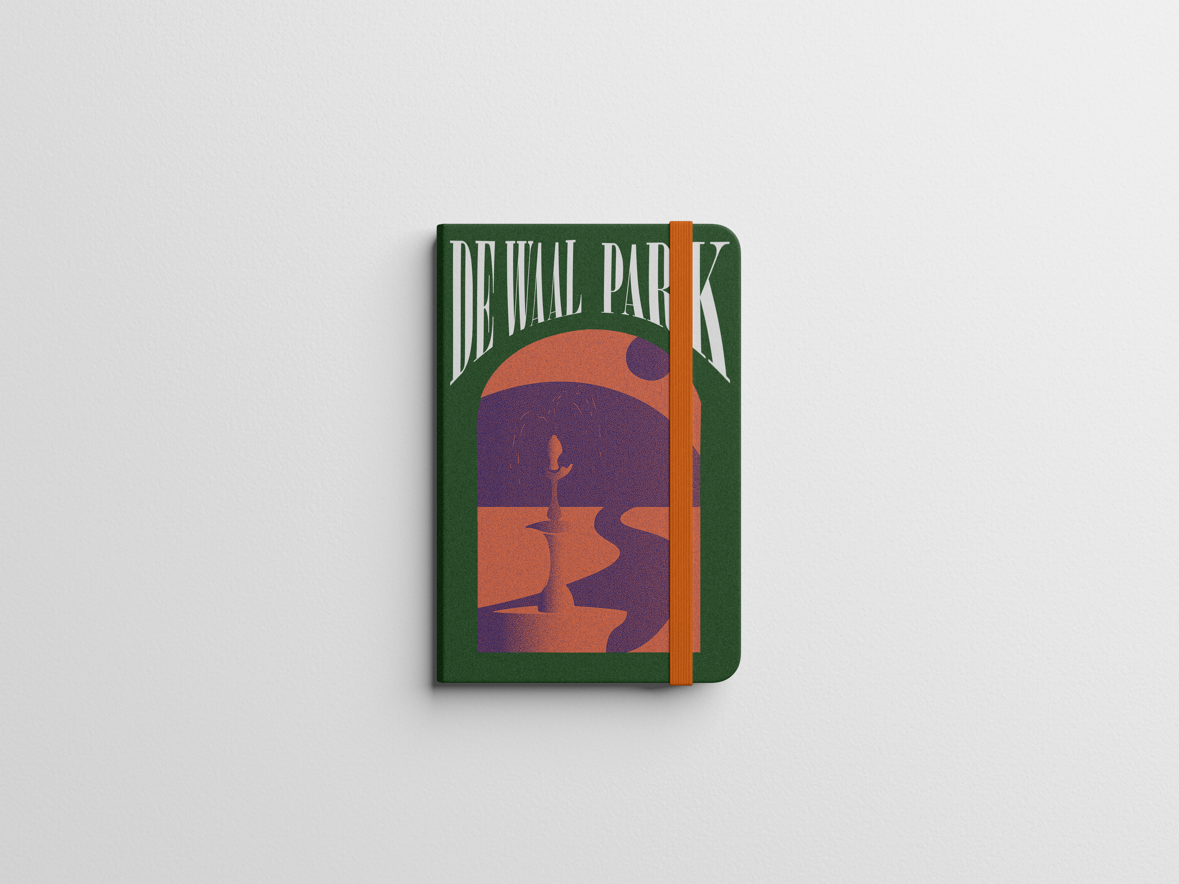


“De Waal: A Walk in the Park” sets the stage for an engaging rebranding concept based on improving communication and accessibility through an updated website and app. The goal of this concept is to inspire a sense of simplicity, leisure, and happiness connected with a visit to the park. The redesigned website would be transformed, offering a seamless user experience that allows visitors to easily access critical information. The website becomes a key point for participation and information, with an easy interface, interactive maps, event calendars, and features highlighting the park’s assets and history. At the same time, a specialized mobile app enhances the tourist experience. The app provides real time updates on events, facilities, and weather, keeping visitors informed and connected. Interactive maps, virtual tours, and user-generated material encourage exploration and a sense of community. The rebranding initiatives also highlight effective communication channels, such as newsletters, an active social media presence, and online forums, allowing visitors to share their experiences, provide feedback, and stay up to speed on park-related news.
Russian Tattoo Encyclopedia
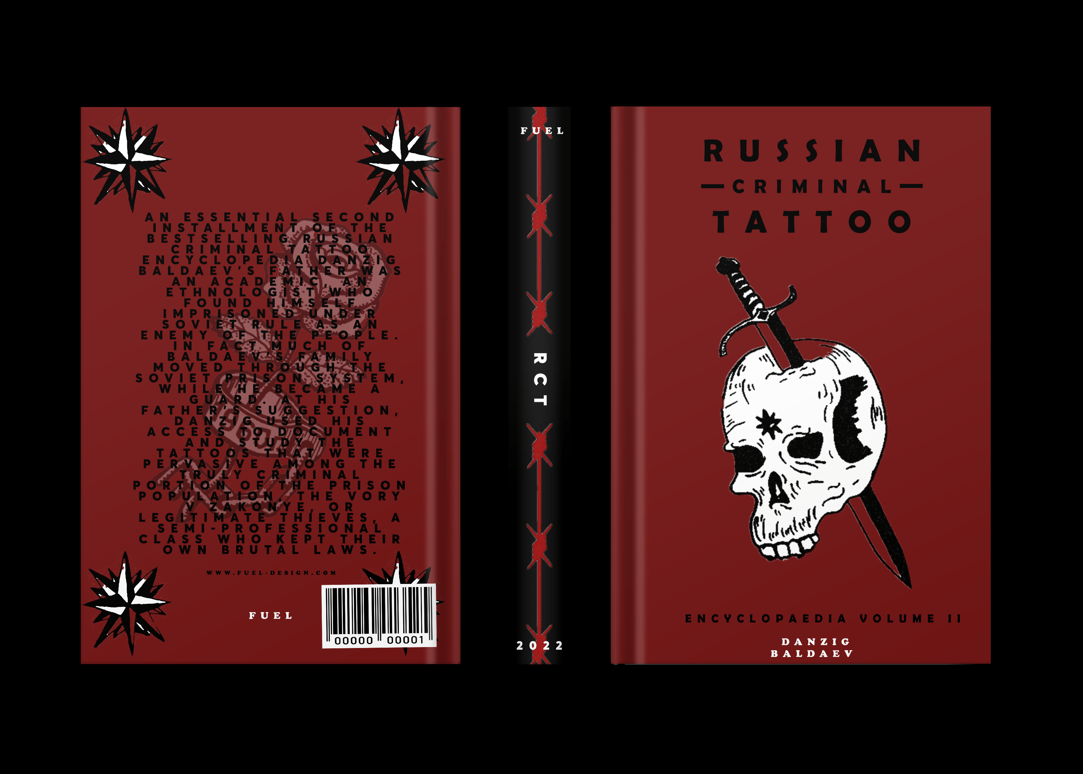
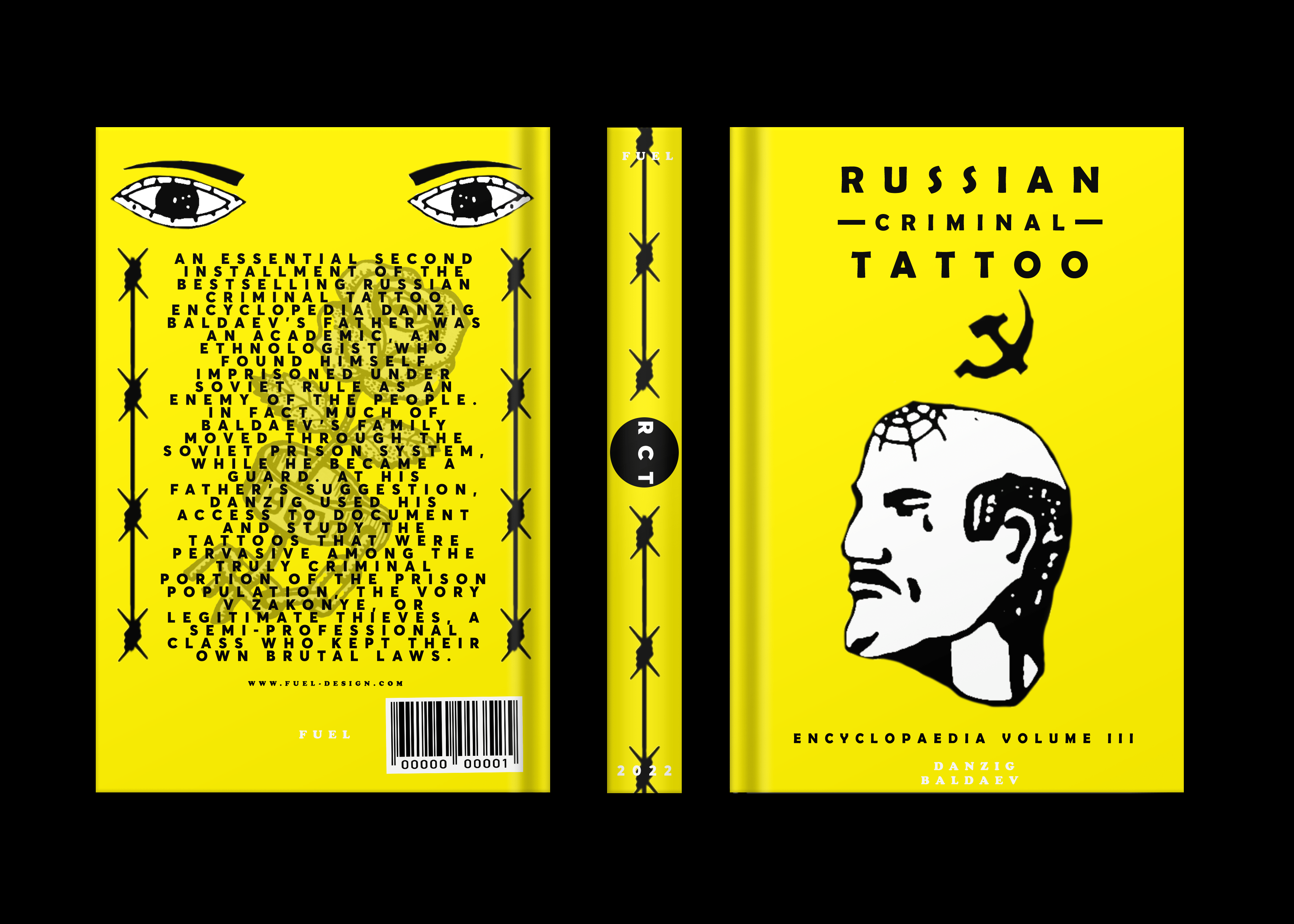
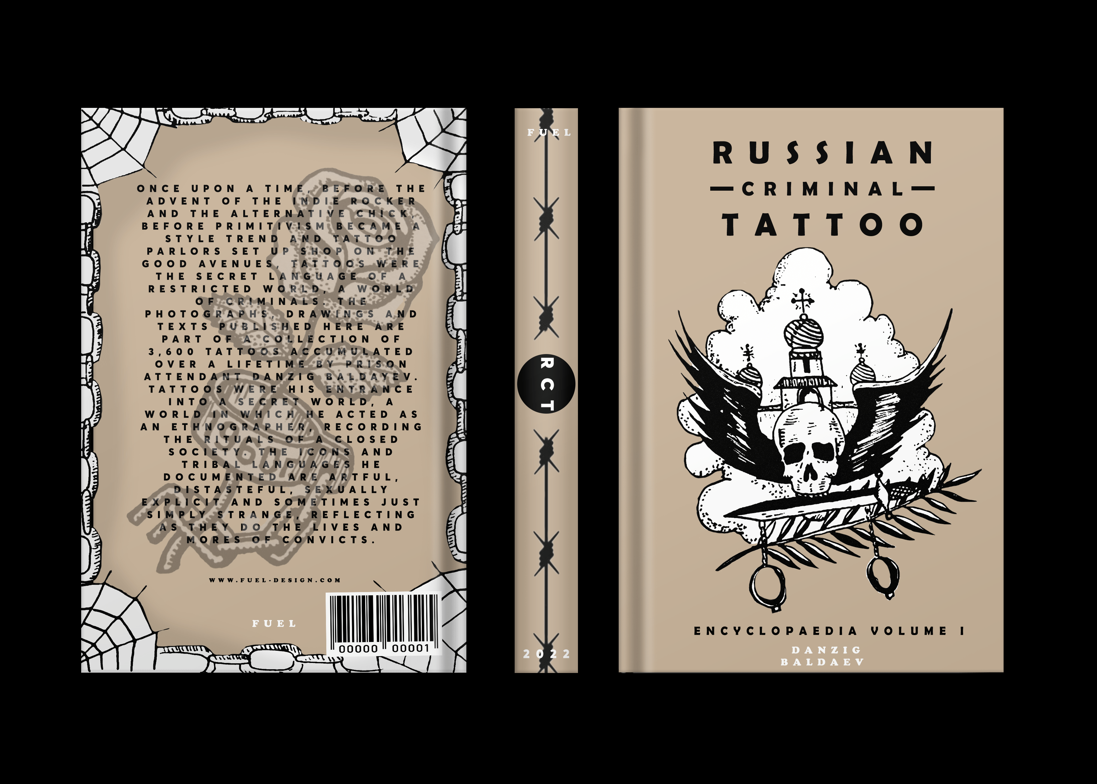
For this project I decided to choose a book series that I was interested in and could make something really cool out of. I chose a book that already had massive potential for illustrative covers. After countless research, I saw how this writer and artist used actual tattoos for covers and other illustrative pieces. I wanted to do the same and I found different meanings of tattoos and that connected to my concepts. Because of this, I had free range design wise, and I wanted to keep the same visual aspect of the book by keeping solid colours for the books with a bit more illustration on each book.
My medium was fine liner, water colour, and black copic for dark features. This made it a lot easier to digitize it as I could bring it into illustrator and darken it to look like a printed illustration and make it look like and actual book (like the actual book series). Having a solid background also pushes out the dark illustrations as well as name of the book. The illustrations work in contrast with the books and the concept, when someone looks at the cover without reading the title they can get a sense of the aesthetic, vibe, and overall paint a picture what the book could be about. It isn’t busy with too much going on but rather simplistic and hardcore like the content of the book
. The style of the book is called ignorant style and follows in contrast of what Russian tattoos look like as well as the roughness of it all. The style and medium all suit each other, and the composition is solid and flows with the viewers eyes. Because this is a book with a lot of imagery inside and not a textual based book, the cover needs to follow that. By having too much writing on the cover, it will throw the viewer off.
Castle Lite
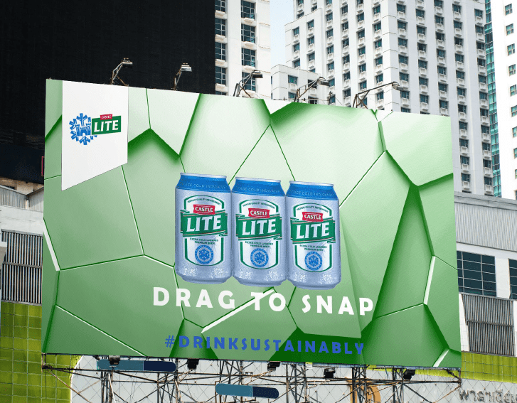
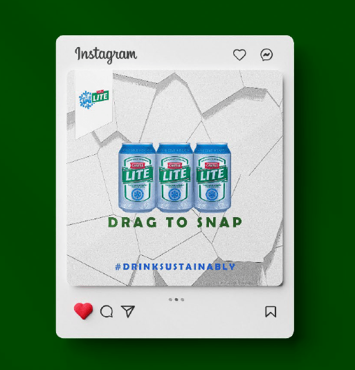
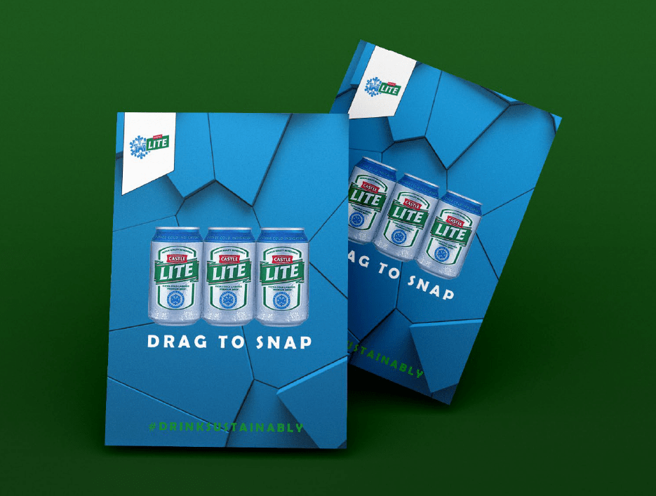
The purpose of the campaign is to create a solution for environmental safety regarding castle products, specifically the classic 6 pack beer. The aim is to create a solution using glue to hold together the beer cans and getting rid of heavy-duty plastic. This has 76% reduction in plastic usage. Overall, this decreases the consumption heavily as sporting events, concerts etc. which sell a large number of beer (as castle is a big sponsor for sporting events as well as concerts) will be generating a lot less use of plastic overall.
For consumers who want to enjoy a climate aware beverage, Castle is an environmentally sustainable beer company that offers a guilt free experience, so that customers can make an impact every time they purchase a castle product because Castle is innovative and willing to make a difference in the world.